Dask Dataframe on NYC Uber/Lyft Data
Do people actually tip in New York City?
Introduction#
This example analyzes NYC ride-sharing data to compare tipping patterns between Uber and Lyft riders. We'll process over 200 million rides from both services, discovering which company's riders are more generous and how tipping behavior has changed over time.
The analysis processes over 85GB of data in just a few minutes, a task that would be difficult to perform on a local machine. You'll need the following packages:
pip install coiled dask[complete] matplotlib
pip install coiled dask[complete] matplotlib
Full code#
Run this code to analyze tipping patterns. If you're new to Coiled, this will run for free on our account.
import coiled
import dask.dataframe as dd
import matplotlib.pyplot as plt

# Create a Coiled cluster
cluster = coiled.Cluster(n_workers=10)
client = cluster.get_client()

# Load the data from S3
df = dd.read_parquet("s3://coiled-data/uber/")

# Feature engineering
df["tipped"] = df.tips != 0
df["tip_frac"] = df.tips / df.total_amount
df["service"] = df.hvfhs_license_num.map({
    "HV0002": "juno",
    "HV0003": "uber",
    "HV0004": "via",
    "HV0005": "lyft"
})
df = df.drop("hvfhs_license_num", axis=1)

# Persist the data in memory
df = df.persist()

# Analyze tipping frequency by service
tipping_by_service = df.groupby("service").tipped.mean().compute()
print("Tipping frequency by service:")
print(tipping_by_service)

# Set index for time series analysis
df = df.set_index("pickup_datetime")

# Plot tipping amounts over time by service
plt.figure(figsize=(10, 6))
df2 = df.loc[df["tipped"]]
df2.loc[df2["service"] == "uber", "tip_frac"].resample("1w").median().compute().plot()
df2.loc[df2["service"] == "lyft", "tip_frac"].resample("1w").median().compute().plot()
plt.legend(["Uber", "Lyft"])
plt.title("How much do riders tip?")
plt.xlabel("Time")
plt.ylabel("Tip [%]")
plt.show()

# Clean up
client.close()
cluster.close()
After running this code, we'll explore what happened in detail, analyzing the results and explaining the technical approach.
The Problem#
The NYC Taxi & Limousine Commission releases detailed data on every ride-sharing trip in New York City. This dataset is enormous, containing information on hundreds of millions of trips by Uber, Lyft, and other services. Analyzing this data can reveal fascinating patterns about how people use ride-sharing services and how drivers get paid.
The challenge? The full dataset is about 85GB, making it difficult to process on a typical laptop. Loading it into memory would likely crash your computer, and even if you could load it, calculations would be painfully slow.
We'll solve this problem using Dask Dataframes to spread the work across multiple machines in the cloud, making the analysis fast and efficient.
Loading and Processing the Data#
First, we create a Coiled cluster with 10 workers. This gives us enough computing power to handle our large dataset:
cluster = coiled.Cluster(n_workers=10)
client = cluster.get_client()
cluster = coiled.Cluster(n_workers=10)
client = cluster.get_client()
Next, we load the data from an S3 bucket. Dask allows us to read the Parquet files in parallel across our cluster:
df = dd.read_parquet("s3://coiled-data/uber/")
df = dd.read_parquet("s3://coiled-data/uber/")
This dataset contains ride information including pickup and dropoff times, locations, fares, and tips. We need to perform some feature engineering to prepare for our analysis:
# Create a binary column indicating if a tip was given
df["tipped"] = df.tips != 0

# Calculate tip percentage relative to total fare
df["tip_frac"] = df.tips / df.total_amount

# Map company codes to friendly names
df["service"] = df.hvfhs_license_num.map({
    "HV0002": "juno",
    "HV0003": "uber",
    "HV0004": "via",
    "HV0005": "lyft"
})
Analyzing Tipping Patterns#
After setting up our data, we can analyze tipping behavior. First, we examine the overall frequency of tipping:
# About 16% of all rides include a tip
df.tipped.mean().compute()
# About 16% of all rides include a tip
df.tipped.mean().compute()
This reveals that only about 16% of NYC ride-sharing customers leave a tip. Next, we can compare tipping frequency between different services:
# Compare tipping frequency between different services
df.groupby("service").tipped.mean().compute()
# Compare tipping frequency between different services
df.groupby("service").tipped.mean().compute()
The results show that Lyft riders tip more frequently (about 19%) compared to Uber riders (about 15%). This is a significant difference that could affect driver preferences between platforms.
For time series analysis, we set the pickup datetime as our index:
# Set pickup datetime as index for time series analysis
df = df.set_index("pickup_datetime")
# Set pickup datetime as index for time series analysis
df = df.set_index("pickup_datetime")
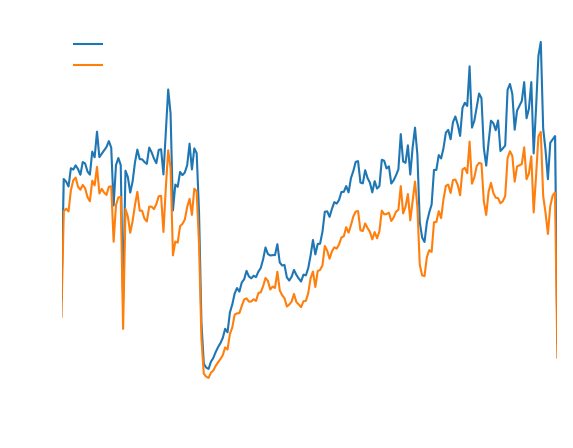
Now, let's visualize how tipping behavior differs between services over time:
# Analyze tipping percentages over time for each service
import matplotlib.pyplot as plt

ax = plt.subplot()
df2 = df.loc[df["tipped"]]
df2.loc[df2["service"] == "uber", "tip_frac"].resample("1w").median().compute().plot(ax=ax)
df2.loc[df2["service"] == "lyft", "tip_frac"].resample("1w").median().compute().plot(ax=ax)
plt.legend(["Uber", "Lyft"])
plt.title("How much do riders tip?")
plt.xlabel("Time")
plt.ylabel("Tip [%]");
The visualization reveals that Lyft riders consistently tip a higher percentage (around 18%) of their fare compared to Uber riders. Uber riders' tipping behavior shows more volatility over time, with periods of both higher and lower generosity.
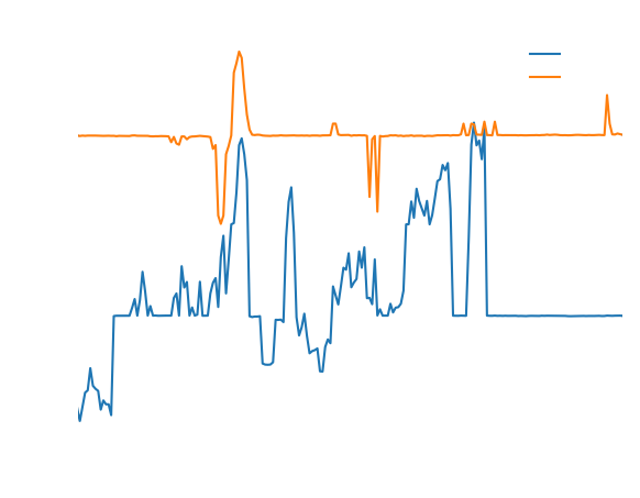
We can also analyze how rider spending and driver pay changed over time:
# Compare base passenger fare with driver pay over time
import matplotlib.pyplot as plt

ax = plt.subplot()
df.base_passenger_fare.resample("1w").sum().compute().plot(ax=ax)
df.driver_pay.resample("1w").sum().compute().plot(ax=ax)
plt.legend(["Base Passener Fare", "Driver Pay"])
plt.xlabel("Time")
plt.ylabel("Weekly Revenue ($)");
This visualization reveals several important trends:
- The dramatic drop in ridership during the COVID-19 pandemic in early 2020
- A smaller drop when the Omicron variant was first detected
- The eventual recovery to greater-than-pre-COVID levels
- An increasing gap between what riders pay and what drivers receive, suggesting ride-sharing companies are taking a larger cut over time
Results#
Our analysis revealed several interesting patterns in NYC ride-sharing tipping behavior:
- Overall, only 16% of ride-sharing customers in NYC leave a tip.
- Lyft riders are more generous, with 19% leaving tips compared to 15% of Uber riders.
- Among those who do tip, Lyft riders consistently tip a higher percentage (around 18%) of their fare compared to Uber riders.
- Uber riders' tipping amounts showed more volatility over time.
- We also discovered that riders spent about $16 billion over the period, with drivers taking home about $13 billion.
- The data clearly shows the impact of major events like COVID-19 on the ride-sharing industry.
Using Coiled, we were able to analyze 85GB of data containing over 200 million rides in just minutes, a task that would be impractical on a local machine.
Next Steps#
Here are some ways you might extend this analysis:
- Try different cluster configurations to see how performance scales with more or fewer workers
- Analyze geographic patterns in tipping by plotting tips across different NYC neighborhoods
- Investigate the relationship between trip distance, time of day, and tipping behavior
- Compare how tipping patterns changed during major events like holidays or the COVID-19 pandemic
- Analyze driver earnings and how much of their income comes from tips versus base fares
Get started
Know Python? Come use the cloud. Your first $25 of usage per month is on us.
$ pip install coiled
$ coiled quickstart

Grant cloud access? (Y/n): Y

... Configuring  ...

You're ready to go. 🎉
$ pip install coiled
$ coiled quickstart
Grant cloud access? (Y/n): Y
... Configuring ...
You're ready to go. 🎉